
- Branding
- Graphic Design
- Advertising
Hunter’s Wine
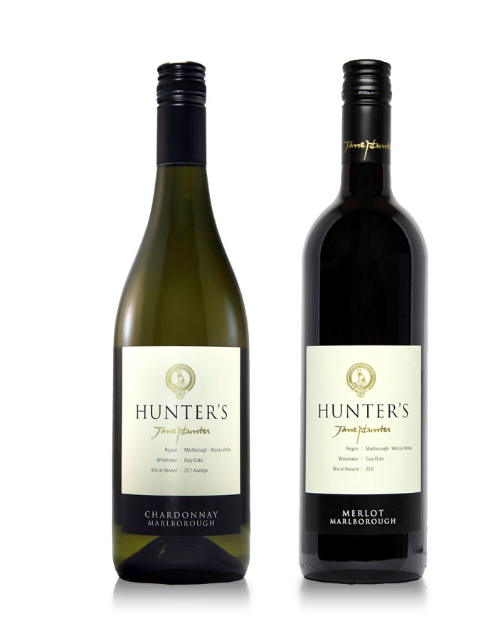
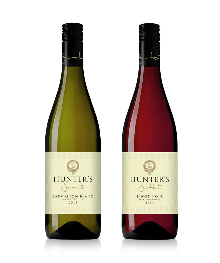
Earlier we were asked to redesign the iconic Hunter’s Vineyard labels. The brief was to give them a timeless elegance that also spoke of the practical values of the wine.
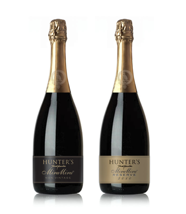
Then recently they asked us to resign them again with a simpler, wider label and to add high build texture. They were looking to lift the perceived value of the label to match more closely the wine quality.
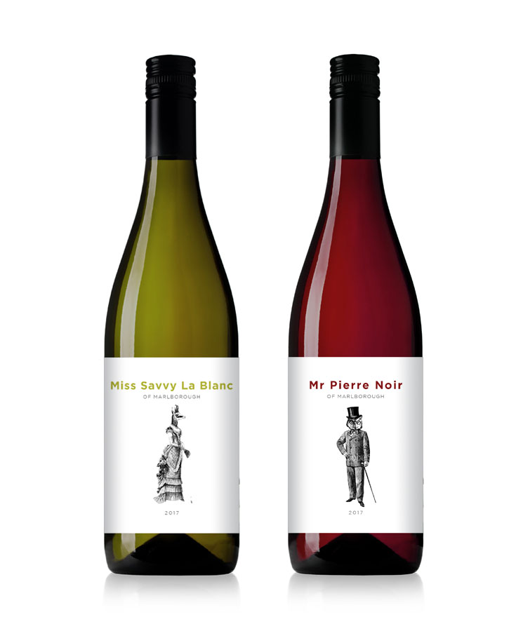
They also asked us to create a more lighthearted second tier brand.